
Banner ads are everywhere because they’re an affordable, measurable, and effective way to increase brand awareness. For radio stations wanting to make any revenue online, they are essential. We drive traffic to our websites from on-air and social media to increase the likelihood that a visitor will click on a banner ad so we can get more money from those advertisers. Generating website traffic is a key step, but another is creating banner ads that generate clicks. We must create the most clickable banner ads possible.
Before we jump into tips on designing effective banner ads. Now is a good time to mention that your sales team must have a Digital Inventory List. We’ve covered this in previous posts and podcasts. A Digital Inventory List lists every ad space, sponsorship, or advertiser opportunity on your station website. It should also cover things off the website, like podcasts, social media posts, Youtube video mentions, live videos, etc. Everything “digital” should be included. Once you have this, it’s much easier for your sales team to know what you have available to sell. If one position on your website is full, perhaps another location or opportunity would be better for their client.
Here are our 10 tips for creating banner ads that get results:
1. Use the most effective, standard banner sizes.
Depending on the message you’re trying to convey, it might be best to choose one size over another.
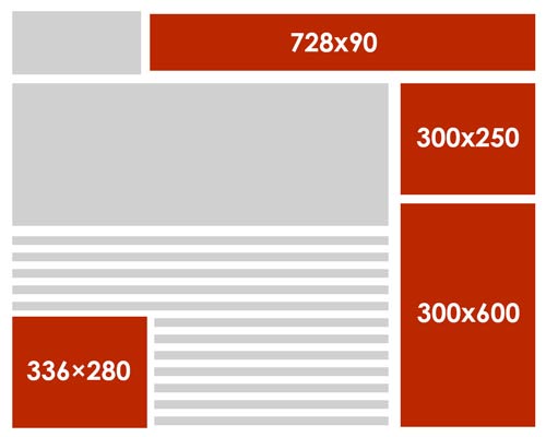
According to Google Adsense, the most successful standard banner sizes are:
728×90px — Leaderboard
300×600px — Half Page
300×250px — Medium Rectangle
336×280px — Large Rectangle
Be sure that you are consistent with your sizing. If you rotate multiple ads in one position and one ad is improperly sized, that fact will overshadow the ad message. As it rotates in and out, the content around it will shift suddenly.
2. Keep banner ads simple
Keep content and visuals simple and easy to consume quickly. Viewers are probably only going to glance at your web banner ad for a second, so do all you can to make them stand out.
Placing the client logo in the middle is simple, but it’s ineffective – for everyone. Logos, by themselves, provide no reason to click. It doesn’t even work well as a brand you’re promoting because it gives no reason for the visitor to remember it.
3. Maintain design hierarchy
Effective banner ads increase brand awareness and drive traffic to your client’s website. Getting the proper message across relies upon the right balance of these three basic components:
Company Logo: Your company logo must be included to build brand awareness, so it should be visually dominant. However, the logo should be balanced with the value proposition and the call to action.
Value Proposition: The value proposition showcases the service/product the client provides and calls attention to itself with an attractive offer or price. Think like: “50% off” or “Limited time offer.” This should take up the most space in your ad and be the first thing that viewers’ eyes see.
Call to Action: The call to action (or CTA) is the text or button that invites users to click. Phrases like “Learn more,” “Get started,” or “Order Now” are some examples of this but try to get more creative than this. Make them more personal to the client, like “Schedule a test drive now,” “Start your vacation now,” or “Show Me What’s In it for Me.” Make it a clear focal point of the ad you’re creating.
4. Make text instantly readable
All copy on the banner ad should be four lines or less. Remember that your ad may only receive a quick glance.
Make your headline and body copy different sizes. When all copy is the same size, it’s perceived as taking longer to read. Make your value proposition larger than the details, so it grabs attention and forces the viewer to stay longer to read more.
Cursive/script fonts, extremely thin font weights. and font sizes smaller than 10 pt. (unless it’s a disclaimer or copyright notice) should be avoided.
5. Instill a sense of urgency
Put your commercial skill to work here. Bring a sense of visual urgency to the text by using contrasting, bold colors. Banner ads are not always meant to be subtle.
The main value proposition and call to action used in a spot may or may not work exactly within their banner ad, so message accordingly. Instill a FOMO or “Fear of Missing Out” in your copy.
6. Be consistent with the client’s brand
Remember that the client’s banner ad will link to their website. The banner ad should match its branding with the colors and text of that landing page so potential customers don’t get confused.
7. Use relevant images when needed
Finding the perfect image for a small space takes time and effort. Choose relevant graphics and photos that enhance the client’s message and are directly related to their product or service. Using stock images that are clearly “stock images” will not help the client.
Remember that it’s not always necessary to use images in banner ads. Effective copy using nice typography in the brand colors can create equally effective results.
8. Choose appropriate colors
Color will be the first thing a user notices. Every color has a different association, and it’s important to consider the emotion you want to evoke. In most cases, you’ll take colors from the client’s website or logo. However, if they are having a specific event, sale, or promotion, it might be better to use a contrasting color that invokes emotion.
Creatopy.com has a great read on how color can affect a viewer’s emotion and perception of the brand: https://www.creatopy.com/blog/color-banner-design-inspiration/
9. Use animation
Animated web banner ads usually outperform static banner ads. They can be very effective in website banner design, but you must ensure that they don’t distract from the message of your ad.
Studies show that it’s best to use simple animations that last no more than 5-10 seconds and make sure they do not loop more than three times. Make the last frame of your animation a clear call to action, so when it does stop, it stops on what you want them to do.
10. Use the correct file formats and keep them small
JPG, PNG, GIF, or HTML5 files will be your working deliverables. JPG is most widely used for static ads. PNG files will work also, but typically, they should be reserved for transparency. GIFs are popular for animation as well as HTML5 ads.
When it comes to file size, the smaller the better—under 150 kb, according to Google Adwords. I like to keep my banner ads below 50kb. Your ads must load fast on the page before viewers scroll down and miss them.
Wrapping Up
There you have it! These are just some banner ad design guidelines, but it takes a lot more to create truly awesome, high-performing ads. If graphic design is not your thing, or you’re too busy running your radio station, reach out to designers on services like fiverr.com to design the perfect, clickable ads for you.
Get weekly radio website help delivered each week!
We want to help your radio station grow and succeed online. That journey starts with an amazing website that keeps visitors coming back often. Reach out to us to start your path to online success, or book an appointment to see our tools in action.