
Is your radio station’s website filled with frustrations that quietly drive listeners away? Does it have cluttered layouts or outdated design elements? These choices can leave listeners with a willingness to jump off.
Your website is critical for keeping listeners engaged and informed. Unfortunately, many websites—especially those that haven’t been updated in a while—still rely on outdated features that do more harm than good. Today, I’ll list the top features and design elements that need to be retired for good and explain why.
Top Features to Change Right Away
1. Auto-playing Audio
Why It’s Annoying: Few things annoy website visitors more than unexpected music or ads blasting through their speakers. Autoplay can feel intrusive, especially if someone is browsing in a public space or at work.
The Fix: While it might seem natural for a radio station website to start streaming immediately, it’s usually better to let users opt-in. Give them a clear, easy-to-find play button for your live stream or on-demand content instead of hitting them with audio they didn’t request.
2. Cluttered, Messy Design
Why It’s a Problem: Overstuffed pages with too many colors, multiple fonts, and elements can overwhelm visitors. People won’t know where to look or click next.
The Fix: Presenting your content in a clean, organized way is crucial for a positive user experience. Simplify navigation, group related items together, and ensure your most important calls-to-action (like “Enter this Contest”) stand out.
3. Too Many Pop-Ups
Why They’re Dated: While pop-ups can be useful for collecting emails or promoting special offers, overusing them frustrates users, leading to higher bounce rates.
The Fix: Strategic, well-timed pop-ups can be effective. Just don’t let them get in the way of what your listeners came for—local information and streaming audio.
4. Overreliance on Stock/Generic Photos
Why It’s an Issue: Generic stock images can feel impersonal and inauthentic, especially when repeated across multiple sites. Likewise, using the same stock image for multiple news stories.
The Fix: We’re in the business of personality. Your listeners connect with the DJs, local events, and the community vibe. Show as many real photos of locations, local events, etc to create a relatable and trustworthy online atmosphere.
5. Obsolete Image Sliders
Why They’re Losing Favor: Large sliders that automatically cycle through images can slow down page load times and distract users.
The Fix: Nearly every station we have spoken with wants to display large sliders with multiple promotions or events. While this might seem like a great way to showcase everything at once, data shows that sliders are often ignored. If you must use one, keep it minimal (two, maybe three of your top calls to action) and ensure it doesn’t bog down your site’s performance.
6. Intrusive or Irrelevant Opt-In Offers
Why They’re Annoying: Offering a newsletter signup or competition entry that interrupts the user at the wrong time, or every time they visit can drive them away.
The Fix: You often run contests or promotions, but asking for sign-ups or personal details too soon (or too frequently) can hurt your credibility. Time your offers wisely—maybe after a user has shown interest in your content.
7. Non-Responsive Designs
Why It’s a Must-Fix: A large portion of your audience browses on phones or tablets. If your website isn’t optimized for mobile devices, users will struggle to navigate or listen live on the go.
The Fix: Listeners might tune in from anywhere—at work, on the bus, or in the car. A responsive design ensures seamless access to your stream, show schedules, podcasts, and more.
8. Using Frames and iFrames Excessively
Why It’s Outdated: Frames-based layouts are an old approach that complicates navigation and can cause problems with search engine indexing and accessibility.
The Fix: Embedding content (like Google Forms) or external widgets (like certain live player tools or social widgets) can be done more efficiently. Ensure your embedded elements don’t disrupt user experience or SEO.
9. Outdated Fonts and Designs
Why They’re Dated: Fonts like Comic Sans or overly decorative styles can make your website look unprofessional or stuck in the early 2000s.
The Fix: Your station’s vibe could be modern, fun, edgy, and or family-friendly. The design needs to match that brand image. Use modern, legible fonts that reflect your station’s personality without alienating viewers.
10. Repeating Background Images
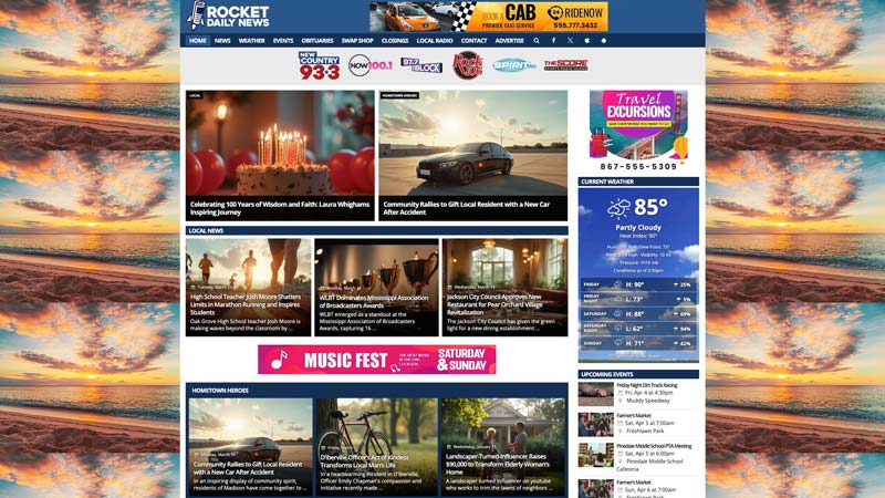
Why They’re a Problem: Once a common design trend (think MySpace), tiled or repeating backgrounds can now make your website look outdated and cluttered. They often distract from your main content and clash with modern design standards.
The Fix: Your listeners need quick access to your stream, schedules, and event info. Don’t let a busy background draw attention away from the content that truly matters.
11. Under Construction Pages
Why They’re Outdated: Having an entire page or section “under construction” signals that your site isn’t well-maintained, which can lead to visitors leaving and not coming back.
The Fix: It’s better to publish a smaller amount of fully functional content than to showcase incomplete sections. Your audience will appreciate reliability over placeholders.
12. Outdated Text
Why It’s a Red Flag: References to events that happened months ago or promotions that have long since ended can make your site feel abandoned. Even small things like the copyright date in the footer (does it still show 2020?) can make your site look outdated.
The Fix: Frequent updates show that you’re actively engaged with your online community. Regularly review your copy, show schedules, and announcements to ensure accuracy and timeliness.
13. Too Much Text
Why It’s Ineffective: Massive blocks of text overwhelm visitors and discourage them from reading important information. Look at your news and blog articles. Most online users skim for key points.
The Fix: Instead of lengthy paragraphs, break up details into bullet points or short sections. This ensures listeners quickly find show times, contest rules, or event details without scrolling through endless text.
Final Thoughts
Your radio station website is an extension of your on-air brand—if it’s saddled with outdated features, you risk turning away loyal listeners and new visitors. By eliminating these old design practices and focusing on a clean, user-friendly experience, you’ll keep audiences engaged, build credibility, and ensure your station stands out in the digital landscape.
Regularly review your website’s features and content. If something feels clunky or dated, it’s probably time for an update. Keeping up with modern design practices and focusing on the user experience will help your station maintain a solid online presence—one that amplifies your on-air success.
We want to help your radio station grow and succeed online. That journey starts with an amazing website that keeps visitors coming back often. Reach out to us to start your path to online success, or schedule an appointment to see our tools in action.